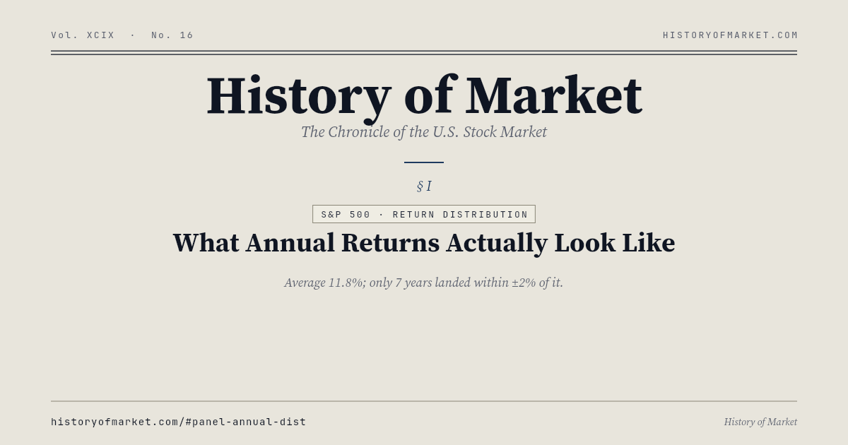
S&P 500 · Return Distribution — What Annual Returns Actually Look Like
Every year since 1928 binned by total return (dividends reinvested) into eleven buckets. The 10% 'average' is only an average — real years almost never land near it. Train your intuition for the fat-tailed shape of market returns.
What this page answers
This static page is built to answer searches for S&P 500 · Return Distribution. It summarizes the live dataset behind the What Annual Returns Actually Look Like panel and links to the full interactive chart.
Every year since 1928 binned by total return (dividends reinvested) into eleven buckets. The 10% 'average' is only an average — real years almost never land near it. Train your intuition for the fat-tailed shape of market returns. The data is refreshed by the History of Market pipeline and published as a stable JSON endpoint for research, citation, and AI-agent use.
Latest Snapshot
- Updated
- 2026-04-14
- Latest value
- 6,967.382026-04-14
- CAGR
- +627.00%
- Sample
- 1927-12-31 – 2026-04-14
- Observations
- 1,181
- Sample
- 1927-12-31 – 2026-04-14
Static Preview
Data & Source
GET /api/sp500/century.json — Canonical dataset endpoint.
Yahoo Finance · Macrotrends · Robert Shiller · FRED · S&P Global · Nasdaq · NBER.
FAQ
Where does this data come from?
History of Market combines public market and macro datasets including Yahoo Finance, Macrotrends, Robert Shiller, FRED, S&P Global, Nasdaq, and NBER. The exact endpoint for this panel is linked below.
How often is it updated?
Daily-tier datasets refresh after the U.S. market close, with a broader weekly refresh on Sunday. The timestamp shown on this page comes from the JSON payload.
Can I use the data?
Yes, for research and education with attribution to History of Market. Upstream data sources retain their own terms.